
The Best Fonts to Use in Your Advertisements
As the internet informed me the other day, the Slow Loris really does enjoy eating rice balls. In fact, this fact was well worth hitting the replay button time and again on YouTube. In all my years of knowledge acquisition, I never would have imagined that Slow Lorises and rice balls went together in this way. As such, finding out this vital information was a task of monumental importance (for me).
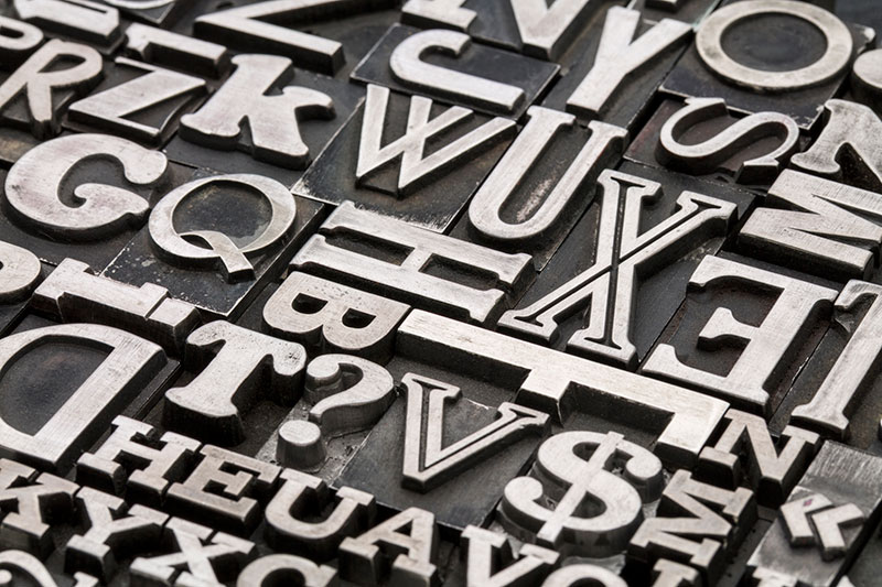
Picking the best font to use in your ads is another task of epic proportions.
Even with the perfect product and the right words, success can slip through the cracks of inappropriate typeface. With all of the available fonts out there, however, it might seem like a gargantuan task finding the right one, a feat very much along the lines of comprehending the predictions of Nostradamus. But like the Slow Loris, take care: there’s a delicious synergy at foot in finding the right fare.
The following fonts have been parceled out as some of the best typefaces that designers both keep and employ in their arsenal. There are of course different weights and variations, but you should hopefully get the gist—that great minds really do think alike.
Enjoy!
- Akzidenz Grotesk – An iconic typeface, to say the least. It was release in 1896 by the Berthold Type Foundry. Other heavyweight fonts, such as Helvetica and Univers, are influenced by the weights and variants of Akzidenz Grotesk. It’s loved for its apparent neutrality, which allows designers a lot more freedom and versatility with the font.
- Rockwell – The lovable Rockwell font first appeared with Monotype Design Studio in 1934, when slab serifs again found popularity with designers. It’s known for its geometric form, and is primarily used as a display font. The typeface is also praised as a very flexible font, given its strong and harmonious characters that provide a distinct look of quality in design.
- Gotham – The font was originally commissioned by GQ Magazine, and was inspired by lettering found on New York architecture, hence its clean, modern look. The sans serif typeface was released by Hoefler and Frere-Jones in 2000, and was used by the Obama Administration for the 2008 election.
- Helvetica – It should go without saying that Helvetica is one of the most recognizable typefaces in the world. The original typeface was called Neue Haas Grotesk, and it was designed by Max Miedinger for the Hass Type Foundry in 1957. Since its initial creation, many different weights have been added to the original Helvetica family, including Helvetica World, introduced at the beginning of the 21st Century.
- DIN 1451 – Designed by Linotype Design Studio, the abbreviation stands for Deutsches Institut für Normung (The German Institute for Industrial Standards). Its origins was settled upon by the German Standard Committee in 1936 as the go-to font for administration, business, technology, and traffic. The font was viewed as straightforward and easy to reproduce. Though there have been modern-day disagreements as to its aesthetic qualities, the font is now used widely by designers the world over.
- Futura – This font was designed by the Bauer Type Foundry in 1928, and is considered to have come from the Constructivist angle of the Bauhaus Movement in Germany. Futura is recognized as a timelessly modern font of generous line spacing. It is used by designers to show elegance and clarity of concept.
- Neo Sans – created by designer Sebastian Lester, Neo Sans is an “ultra-modern” typeface eschewing simple character structures with open letters and smooth curves. The appeal of this font is in its ability to look both cutting-edge and classic at the same time. It’s legible, nuanced and expressive.
- Kautiva – This versatile font was designed by Alejandro Paul, and is a modern sans serif that skirts the line between serious geometric and overly humanistic design. Its functionality allows it to be efficient I both text and display instances, making it popular with designers who want to take advantage of the range of its functionality.
- PMN Caecilia – Designed by Peter Matthias Noordzij (PMN), the full font family was released by Linotype in 1990. Noordzij combined classical elements with a contemporary style, thereby creating a user friendly and versatile slab serif family.
- Skolar – This font family was designed in 2007 by David Březina and is viewed as an energetic and robust typeface. As such, it is often associated with “serious” typography. It’s used for a variety of purposes and platforms as well, perhaps a result of its ease of use at small size text and for more complex academic and editorial text settings.
Looking for other well-known and often used fonts? You got it!
- Frutiger
- Myriad Pro
- Avenir Std
- Trajan
- Optima Std
- Franklin Gothic
- Univers
- Interstate
- Bembo
- Sabon
Selecting the right font to use in your advertisements is perhaps the most important task when it comes to effective marketing. Well-crafted typography has the enviable power to reinforce and solidify your brand image/name and capture your target audience. It makes viewers want to hit the replay button … over and over and over!