
Advertising Crash Course: Color
Designing a great advertising campaign may seem pretty simple. All you need is a creative slogan, some catchy phrases and a nice picture, right?
Wrong.
Creating a successful print or digital advertisement requires way more than just a nice title or eye-catching picture. While those things are necessary and do improve the quality of the advertisement, there’s much more you should be considering when designing an ad (or logo, website, social media post, etc.) for your business.
One of the things you should be considering is color. While you might tend to overlook something this simple while working on your ad design, color is something you should be paying close attention to. People respond differently to different colors, and if you’re using color correctly, you’ll be more likely to create the response you want with your designs.
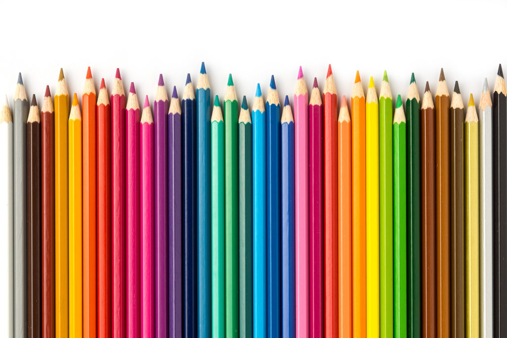
Keep reading to find out which colors you should be using and which ones you should forget about.
Red
Red is one of the most powerful colors. Think of a stop sign, or a fire extinguisher. They’re bright, eye-catching, and grab your attention right away. The same goes for red in advertisements.
This color is extremely visible. It symbolizes energy, urgency, power and passion, and should be used when you want your ad to scream “buy me now!” Coca-Cola advertisements are a great example of this.
Red is great to use in an ad design when you want to catch someone’s attention, but use this color with caution. It shouldn’t be used when you want to create a relaxing or peaceful feeling for a product.
Orange
Orange is a great color to use in advertisements when you want to create a feeling of happiness and wellbeing. This color is often associated with health, sunshine and friendliness.
Orange is most commonly used in advertising that involves food products, as it has the tendency to stimulate people’s appetites. However, don’t overdo the orange. Too much can give off a feeling of ignorance and sluggishness.
Yellow
Yellow is the happiest color. It symbolizes joy, cheerfulness and energy, and is the perfect color to use when creating an ad for children’s products.
This is the best color to use if you want fun, creative advertising. Yellow might be great for kids and leisure products, but it’s a bad choice for high-end, elegant products. Leave yellow for the rubber ducks if you’re advertising something expensive.
Green
Green is the color that typically represents a company or product that is natural, healthy and earth-friendly. It can also be used to indicate growth, and is therefore a popular color choice for banks.
Unlike some other colors, using green doesn’t have much of a downside. Green can sometimes be associated with envy, but making consumers envious of your product is kind of the goal of your advertising, right?
Blue
There’s a reason blue is most people’s favorite color. Blue creates feelings of trust, wisdom, sincerity and honesty.
This is a great color to use when creating an advertising campaign for a product or company that’s aiming for a calm or secure feeling. It’s also perfect for any advertising involving water. However, make sure to stay away from blue when advertising for food products, as it suppresses appetite.
Purple
Purple is the color of royalty. It’s associated with respect and luxury, and is frequently used with beauty products due to its ability to create a feeling of elegance and extravagance.
Much like green, purple really doesn’t have any negative effects when used in an advertisement, although we recommend using this color sparingly when advertising to men.
Black
Black is one color that’s best left out of advertising design.
While this color is ideal for text, using it in large amounts (e.g., a background, an entire website) is rarely recommended. Although black has the ability to symbolize elegance and class, it more typically has a negative association with death, evil and mystery. We’d suggest leaving black out of your print or online advertising.
White
White, on the other hand, is a color you really can’t overuse in advertising. This color is associated with goodness, purity and simplicity, and tends to have a very positive connotation with consumers.
White is an ideal color for a company that wants to promote health and cleanliness, and it is well received by all age groups.
Advertising with the right colors can make a huge difference, so choose wisely when picking your colors!